In this blog I am going to show how to use MarketWarrior 5’s automatic forecasting tool for the 5 minute chart. I am going to be using the S&P500 symbol from Google Finance, LNX. I will also be using the NIFTY50 symbol $SPIR from Barchart.com. The forecasting tool we are using is applied to a price chart by clicking the button labeled ‘5/60Min Forecast’. This is show in the first picture below. The blog will cover July 20th to 24th.

JULY 20, 2017
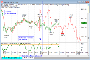
The picture below shows the 5 minute chart for the S&P500 using the symbol LNX. This S&P500 symbol has data from 9:30AM when the main trading session opens in the US to 3:59PM when the main trading session closes. The MarketWarrior 5 automatic forecasting tool has been applied to the chart below. The forecast can be recalculated as often as you want or not at all. When I use this forecasting tool I do not recalculate very often, usually from zero to two times a day and that is all.
On the chart below I have added the forecasting tool at 9:55AM on July 20, 2017. I have added a blue vertical line marking the time 9:55AM when the forecast was made. I usually select a time close to 10:00 AM because I want the opening gap and the first few bars to be included in the forecast calculation. The forecasting tool is converting the recent price action into a cycle and is then extending the cycle forward.
On the chart below you can see the price action for July 19, 2017 was upward sloping with almost know counter-trend declines. This usually results in the next days forecast showing a strong up move. This is what happened on July 20, 2017, the forecast made in the morning at 9:55AM was a strong up move.

Click To Enlarge
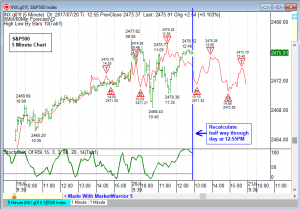
The next chart shows the 5 minute chart about half way through the day. The price action did not follow the forecast and there was no trade to be made. When I am recalculating a forecast I only do it a few times a day. If the forecast is wrong and the market is not following then there is nothing to trade. I like to recalculate a forecast half-way through a trading day for the market I am looking at. In this case between 12:30PM and 1:00PM represents halfway through the trading day. The chart below shows the errant forecast with the price data through 12:55PM. On the next chart I am going to recalculate the forecast.

Click To Enlarge
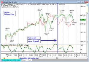
The picture below still shows July 20, 2017 and I have now recalculated the forecast at 12:55PM. The new forecast shows the remainder of the trading day which is three hours from 1:00PM to 3:59PM. There are now four forecast turning points. Two bottoms and two tops.

Click To Enlarge
The final two charts show how this worked out in the second half of the day. The pattern of two bottoms and two tops with a decline into the end of the main trading session did in fact occur. The forecast for the second half of the day was accurate. The green indicator in the sub-chart is the ‘Stochastic of RSI’ which is one of the better momentum indicators for small time frame charts such as 5 minute charts.

Click To Enlarge
The final picture below shows the forecast line with no top and bottom markers so it can be seen clearly. When the forecast line shows a bottom and the Stochastic of RSI is over sold it is a buy signal. When the forecast line is showing a top and the Stochastic of RSI is over bought it is a sell signal.

Click To Enlarge
JULY 21, 2017
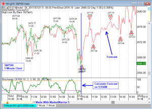
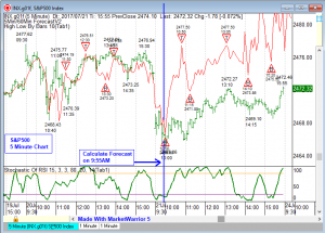
The picture below shows the Google Finance symbol LNX for the S&P500. This is a 5 minute chart and is a continuation of the chart above. On July 21, 2017 I waited for the main trading session to open to see the opening gap and then calculated the forecast at the same time seen in the previous example which was 9:55AM. I have added a blue vertical line making 9:55AM. The forecast tool calculates a cycle from the recent historical data and then extends the cycle forward as the red line.

Click To Enlarge
The green line in the sub-chart is the Stochastic of RSI indicator. The red forecast line is above the actual price data for July 21, 2017 but the pattern is correct. On this day no recalculation was necessary. The forecast turning points were close to market turning points. The forecast pattern, trend and direction were similar to the actual market.

Click To Enlarge
JULY 24, 2017
Below is an example for the S&P500 using the Google Finance symbol LNX. The chart is again a 5 minute chart. I am going to apply the same procedure to using the forecast line. On July 24, 2017 I waited to see the opening gap and allowed a few bars to form. I added the forecast indicator at 9:55AM just before 10:00AM. The forecast line is the red line that extends to the end of the day.

Click To Enlarge
It was apparent by 11:00AM the forecast was errant and was not aligning to the S&P500 price movements. I waited until the middle of the day to recalculate the chart. Recalculating at the middle of the trading day usually generates good results but you can recalculate at any time.

Click To Enlarge
The picture below shows the forecast after I recalculated it at 12:55PM. This is the same time I recalculated in the previous July 20, 2017 example. Using a starting calculation at 9:55AM and a recalculation time, if it is needed, at 12:55AM seems to work well for the S&P500 chart. The green line in the sub-chart is the ‘Stochastic of RSI’ indicator which works well on the S&P500, 5 minute chart.
When the forecast line shows a bottom and the Stochastic of RSI is over sold it is a buy signal. When the forecast line is showing a top and the Stochastic of RSI is over bought it is a sell signal.

Click To Enlarge
Below is the final chart for the July 24, 2017 S&P500. The forecast line for the second half of the day shows a rally for most of the time from 1:00PM to 3:59PM with a decline at the end of the day. The red forecast line shows a price swing from low to high that is larger than the actual price swing but the pattern, trend and direction is correct.

Click To Enlarge
JULY 21, 2017 – NIFTY 50 symbol $SPIR
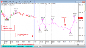
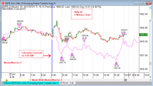
The two pictures below show an example for using the forecast tool on the 5 minute chart for the Indian stock index NIFTY 50. This chart is using the Barchart.com symbol $SPIR. This symbol trades almost 24 hours a day but there is a main trading session that runs from 9:00AM to 3:59PM.
On the chart below I calculated the forecast just after the main trading session opened at 9:05AM. I have added a blue vertical line marking the time when the forecast was calculated. The forecasting tool is calculating a cycle from the recent historical data and then it is extending the cycle into the future.

Click To Enlarge
Below is the same forecast as above, but now with the data through the end of the main trading session. This forecast was accurate enough that I would not have recalculated the forecast during the day. I do not trade the NIFTY 50 but I will try to get more examples showing the forecast tool with the NIFTY 50 because we get a lot of requests for showing this index.

Click To Enlarge
end.


